InputBase
Simple building block for creating an input which comes with basic default styles (colors, rounded borders).
Import
import { InputBase } from "~~/components/scaffold-eth";Usage
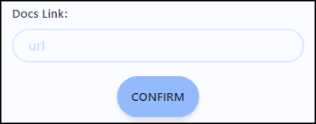
const [url, setUrl] = useState<string>();<InputBase
name="url"
placeholder="url"
value={url}
onChange={setUrl}
/>Props
| Prop | Type | Default Value | Description |
|---|---|---|---|
| value | string | undefined | The data that your input will show. |
| onChange | function | undefined | A callback invoked when the data in the input changes. |
| placeholder (optional) | string | undefined | The string that will be rendered before input data has been entered. |
| name (optional) | string | undefined | Helps identify the data being sent if InputBase is submitted into a form. |
| error (optional) | boolean | false | When set to true, changes input border to have error styling. |
| disabled (optional) | boolean | false | When set to true, changes input background color and border to have disabled styling. |